GETTING STARTED
Analysing results
Step 1: Retrieve the results
See “Downloading results in eTemperature” or press the “Load File” button. Note that this will be disabled if there is a logger in the reader.
The open file dialog box will appear. Select the required file.
Step 2: Tips using the graph
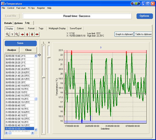
If the alarm limits were set correctly then all readings in green should be acceptable. Readings in red were too warm and readings in blue were too cool. You can manually change the alarm limits by moving the slider bars to the left of the graph.
Clicking on the graph will automatically take you to the closest reading in the table/grid on the left.
Moving the mouse over the graph will update the cursor information with the date/time and temperature of where the mouse is over.
To zoom in hold down the left mouse button and drag from the top right to bottom left of the area you want to zoom in on. To zoom out, drag in any other direction.
To move the graph along (pan) hold down the right mouse button and drag it.
A demonstration of these features is available on our YouTube channel and on our Video page.

Advanced Features
The following features are available. If you require further information either consult the full manual or contact us:
- Export to Microsoft Excel or Microsoft Word
- Saving of graph to clipboard
- Analysis including averages, min/max, ice-days and mean kinetic temperature
- Multiple results on one graph
- Steriliser analysis
- Food cooling analysis (HACCP compliance)
- Emailing results
