The Graph |
  
|
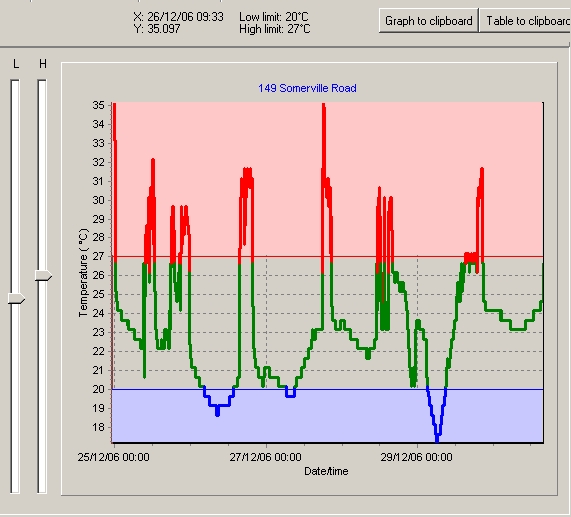
The Graph |
|
The log displays a list of date and times and the reading. They will either be the first or last readings depending upon the allow rollover setting. The log is useful for watching the trends in the temperature as well as pinpointing specific information.
The graph displays the temperature versus time. By moving the cursor over the graph, the time and reading can be viewed on the display tab.
It is possible to zoom in on data by selecting the top left corner of the desired area and with the left mouse button held down dragging the mouse to the bottom right hand corner. To zoom out simply drag the mouse in any other direction.
The zoom buttons can also be used to manually zoom in and out.
The display can be scrolled left, right, up or down by holding the right mouse button and moving in the required direction. The scroll buttons at the bottom of the graph can also be used.
Save to clipboard will save the graph to the clipboard. The graph is stored in a standard graphical format which means it can be easily pasted into most applications that support graphics including Microsoft Word and Microsoft Excel. To paste the graph, in the other application select Edit from the menu and Paste or try Ctrl-V.
The colour coding of the graph is set by the high and low alarm limits. These default to what were stored in the logger at the time of programming. Any readings above the high limit will be red, below the low limit blue, and normal readings green.
Note: Technically the line will be red or blue from the previous normal reading to the next normal reading. This means that the red or blue line will also appear in the normal range. This is because it is not possible to tell exactly when it went into alarm so eTemperature high lights the entire range.